MT FRANKLIN LIFTS BREAST CANCER AWARENESS VIA PUBLICIS MOJO

 Out-of-home company, oOh!media, has created two points to spread the message of Mount Franklin’s support for Breast Cancer week.
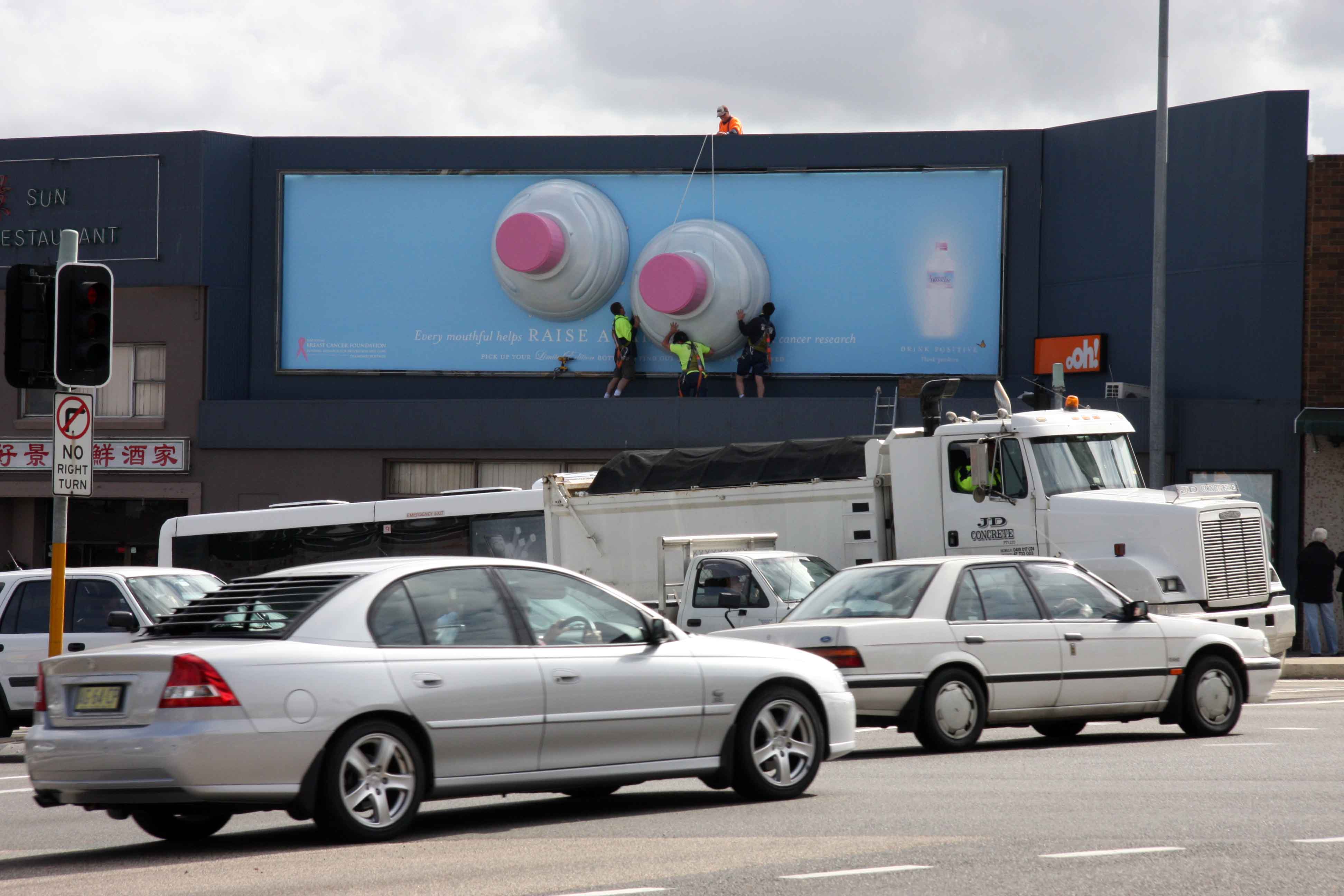
Aspart of Mount Franklin’s sponsorship of the Pink Ribbon campaign, theout-of-home company has worked with Coca-Cola Amatil’s creative agency,Publicis Mojo and media agency, Ikon Communications, to establish atwo-month campaign that includes three-dimensional special buildsdepicting two pink-capped bottles on their side.
Thethree-dimensional special builds are made from a new polystyrenematerial, meaning that the weight is less than materials previouslyused for special builds and installation is easier than ever before.
Thespecial builds – which will be erected at ten sites in NSW, Victoria,Queensland, SA and WA from today through to mid-November – isaccompanied by a tagline advising that “Every mouthful helps RAISEAWARENESS for breast cancer research”.
These special builds areaccompanied by an additional 52 large format billboards across thestate, using oOhroad! and Eyecorp inventory.
25 Comments
Very nice. And refreshingly politically incorrect.
Boobies!
I have to say driving towards them I thought these were giant fried eggs, but made me look so that’s a plus.
Do they really think that women who have lost their breasts need to be reminded about it? Bit insensitive.
I couldn’t read it driving past. I also thought they were fried eggs. Small white type on a billboard is a hard ask. It’s nice and simple, but too hard to read.
Just because the top of a water bottle looks like a boob …does NOT a good idea make. Visual puns should be left where they belong…in the 80s.
‘Every mouthful’?!
The copy begins:
‘Every mouthful helps…’
Could of choose a more sensitive beginning to the pay off’.
Has concept has been done many times before – but this is 3d so it is much more creative.
A good cause likes this deserves a better/original idea. Too easy.
chill out guys. at least it ran and it’s funny for some. more clever than… can’t remember the last decent bit of outdoor i saw.
Two Target logos side-by-side on a giant poster.
Headline: Australia’s largest range of bras.
Copywriter: Tim Hall
Art Director: Doug Byrnes
Another vote for fried eggs. And an illegible headline.
Do your eggs have pink yolk? That means they’re half fertilized you fuckwit.
genius, great work
they look awesome
who ever sculptured and sanded them deserves a raise
I dare say this was put up by the outdoor company, not the agency involved. Hence the lack of credits. Saying that, super media placement. Smack bang in the middle of a school zone. I’d love to be a fly on the wall in the cars on the school run.
do chicks with plastic boobs get breast cancer as well?
There is most definitely a reason there are no agency credits here.
Brilliant stuff – I did something similar in 1982
4:59 – Calm down there big fella. At night, with the lighting…they look like eggs.
Tired old Art direction. This whole top of a bottle = breasts has been done to death.
gives nipple tweaks a whole new dimension
Geez guys anybody would think advertising is meant to be about original ideas.
i love this advertisement so much..is very creative…